A lot happens in a year, especially when that year is the first of a new experience. This article shows
the progress and improvements of my first year of cave photography by comparing photos from two cave trips. I completed two photo
trips in the Sinnett-Thorn Mountain Cave System in Pendelton County, West Virginia. They were almost exactly one year apart; the
first was on September 21, 2013 and was my first photo trip. The second was on September 22, 2014, and it was my 22nd photo trip.
This is not coincidental; Sinnett-Thorn is only open for a couple of weeks every September, and it is closed the rest of the year for
bat management. The photos from the second trip were magnitudes better than those from the first.
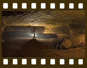
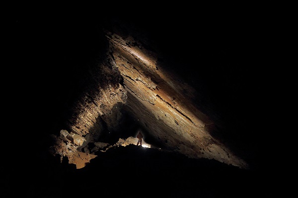
Photo 1: The Sinnett Canyon
Figure 1: Sinnet Canyon photo from 2013.
Figure 2: Sinnet Canyon photo from 2014.
This photo was taken in the Sinnett Canyon passage. It is about 40ft deep and ranges from 2 to 5ft wide. The top of the passage is
lined with black and yellow popcorn colored from excess amounts of manganese. To pass through, one is forced to place on foot on each
wall and spider walk the entire 400ft length. At times you really are spread eagle across 40ft of air.
This is a great example of a bad photo and a good photo of the same subject.
The first photo (figure 1) shows Jon Matthews in the canyon, the second (figure 2) shows Maria Af Rolen. There are a number of striking
differences. The first thing that sticks out is the orientation of the photo. The ridges and edges are better suited for a landscape
photo. By making the photo landscape and placing the person off to the right the canyon edges lead the viewer’s eye to the model.
This “leading line” is a critical component of a photograph that is missing in the first photo.
The next thing that sticks out is the model. In the first photo the model is
wearing brown, muddy clothes and nearly blends in with the background. The model in the second photo is wearing clean blue clothes
and sticks out from the background. This focuses attention on the model as one of the subjects of the photo (the other being the
canyon itself).
 Figure 3:
 "Glow-worms" in the 2013 photo.
There is a final, subtle, difference that most don’t notice. The first photo has
“glow-worms.” This is caused when the model or camera moves during the exposure. Since this photo required me to be out over the
canyon, a tripod was out of the question. In the first photo I held the camera in one hand and manually fired a strobe with the other hand.
This required a shutter of over a half a second. Ample time to move.
The second photo was taken with the strobes hidden in the canyon walls,
one was held above me by a helper. All three were wirelessly synced with radio slaves. This allowed a faster shutter speed of
1/60s, eliminating movement during the exposure.
Photo 2: The Big Room
Figure 4: Big Room photo from 2013.
Figure 5: Big Room photo from 2014.
The highlight of the Sinnett-Thorn system is the 900ft long Big Room. This room is
triangular in cross section and over 40ft tall in places. Like most big places, it is a logistical challenge to photograph. Again here
we see a dramatic difference in the photos. The models are better seen, and they provide better scale for the size of the room. This
was achieved by taking the second photo from atop a large boulder nearly 25ft off the floor. Also, adding more models with lights made
the lighting much smoother and introduced a leading line.
The even lighting and nice pattern comes from the light sources being used. In the
first photo, the two models used a single strobe of relatively low power. These strobes could only light objects about 20ft away
(effective guide number of 160 at ISO400). Thus, each strobe was fired four times rotating 90deg each to provide even lighting.
 Figure 6:
 Noise in the 2013 photo.
 Figure 7:
 Noise in the 2013 photo.
The final thing that made the most difference between the photos is unseen
in the photos themselves: the team behind it. As the first photo was taken during my first ever photo trip, the team I had
(about three people) was disorganized and inexperienced. As such, each photo took a shutter time of nearly 30 seconds. The photos
took forever. The second photo was taken under much more organized conditions. Radios facilitated easy communication to Maria, over
300ft away. Each model was able to reload the bulbs and complete simple troubleshooting. This coordination allowed the shutter speed
to drop to less than 4.5s to fire all four of the bulbs. While each production of photo 1 required nearly four takes lasting ten minutes
each, photo 2 was produced in three takes in twenty minutes total. This perhaps was the most enjoyable photo I took. Everyone was so in
sync, the firings were so coordinated – it was a sight that only someone behind the camera can understand. To see over 400ft of massive
passage light up is absolutely amazing. I shot a video of us taking this photo; it can be seen here.
This coordination had another good side effect: the shorter shutter speed radically
reduced the amount of noise generated. Figures 6 and 7 show the differences in noise levels. Cropped and shown at 100%. The first photo
had so much noise in fact that I had to convert it to black and white. The brighter lights meant that I could use a smaller aperture
(f7 versus f3.5) and have the entire image in much better focus.
Photo 3: A Profile of the Big Room
Figure 8: Profile photo from 2013.
Figure 9: Profile photo from 2014.
A profile of the room was shot in 2013 by having the model, John Harman, fire a strobe
at the walls 4 times. This worked, but had its downfalls; the model is hard to see and the image lacks the “pizzazz” of the second photo
which used one light: a Number 5 bulb in a 7in reflector fired behind the model. The backlighting provided a glowing halo around the model,
and the reflections off the wall lit up his front. The result is a much more colorful and dynamic profile.
Summary: What to Take From This
- One light from the front is flat and boring. Use multiple lights, add contrast and drama to the photo.
- Bring the right tools for the job. Digital strobes simply don’t have the light power that flashbulbs have, and they are nearly impossible to use in large passages and rooms.
- Bring the right team: seriously, they make all the difference in the world!